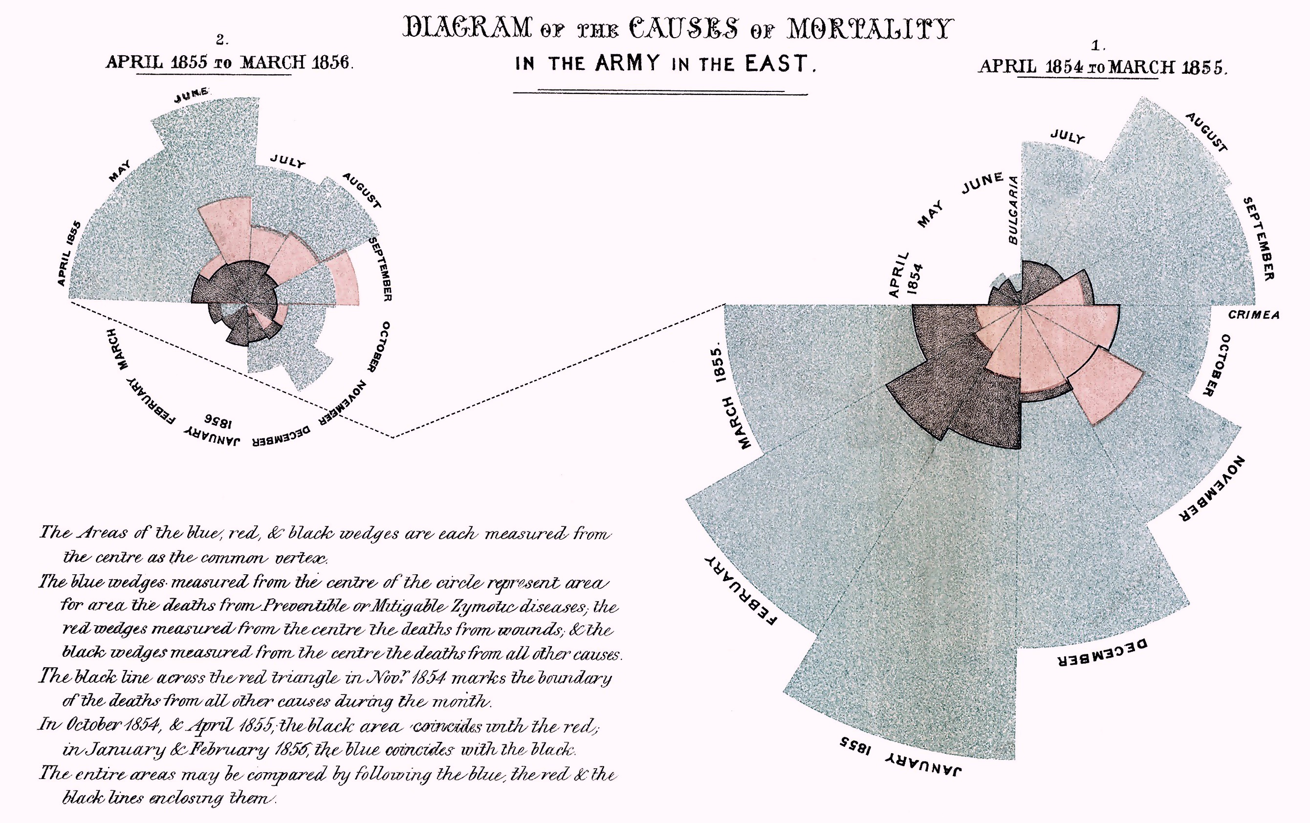
I see information visualization as one of the most fascinating and important areas, particularly useful for researchers and people who work with data. From cases like Charles Minard’s map of Napoleon’s campaign of 1812, and John Snow’s cholera outbreak map of London 1854, we can see examples how visual articulation of data can impact the world. If I were to teach an InfoVis course, I would use the following material and tools.
Books
I can’t think of a specific book that can serve as the course textbook. Hence, I’m recommending multiple sources of material.

One book that’s worth covering is Edward Tufte’s “The Visual Display of Quantitative Information” book. It focuses on comprehensible and usable design, concisely and clearly articulating core principles. It includes many good examples (including examples of poor design).
“Graphical excellence is the well-designed presentation of interesting data—a matter of substance, of statistics, and of design.”
— Edward R. Tufte”
Tamara Munzner’s book, “Visualization Analysis and Design”, does a great job in providing and framing the proper terminology for learning about and discussing InfoVis topics (Figure 2.1 of the book shows a summary of this framework). While, Tamara’s book would work great as a reference book, I don’t think it should be used as the only textbook.
Additional material that may be worth covering or providing as recommended reading: “Envisioning Information” by Edward Tufte, “Visual Thinking for Design” by Colin Ware, and “The Functional Art” by Alberto Cairo.
For aspects of interaction, the paper “Toward a Deeper Understanding of the Role of Interaction in Information Visualization” may serve as a helpful starting point (by Yi et al. 2007).
Additionally, I suggest taking a look at the interesting story of William Playfair, the inventor of the pie chart, the bar graph, and the line graph. Eugene Wei’s depiction of his job at Amazon as the first analyst in the strategic planning department is also worth reading.
An upcoming new book is “Fundamentals of Data Visualization” by Claus O. Wilke. The book seems to be quite comprehensive, fully accessible online, and is entirely written in R Markdown.
No matter what kind of data needs to be visualized, an important question to ask oneself is: are you communicating information, displaying an analysis, or exploring data? For instance, Scott Berinato described four types of visual communication (idea illustration, idea generation, visual discovery, and everyday dataviz). Even something as basic as a table can be improved—not by adding more visual cues, but by removing unnecessary visual clutter.

For more modern examples, the “Information is Beautiful” Awards website showcases interesting award winning examples. These projects were awarded for excellence and beauty in data visualizations.
Software and Tools
These are commonly used tools that I find useful:
- Visualizations with R and R Studio (and packages like ggplot2). Related to visualizations in R, check out the book “Circular Visualization in R”
- A list of 50 ggplot2 visualizations (with corresponding R code)
- The D3.js library is a great JS library for creating visualizations. It’s commonly used and is very customizable. Related to D3, the books “D3.js in Action” by Elijah Meeks, and “Interactive Data Visualization for the Web” by Scott Murray, are exceptionally good (and very practical).
- Tableau or Tableau Public
- The data visualization catalogue, the data viz project, and Xenographics: for choosing the type of visualizations to use
Inspirational People in the Field
Hadley Wickham is a statistician from New Zealand who is currently Chief Scientist at RStudio. He has developed several notable and widely adopted R packages including ggplot2, plyr, dplyr, and reshape2.
David Robinson is the Chief Data Scientist at DataCamp (previously a data scientist at Stack Overflow), and the co-author with Julia Silge of the Tidytext package for R. He writes an awesome blog on data analysis and visualization.
Giorgia Lupi is an award winning information designer. I find her work to be inspirational and superb. I highly recommend her TED talk.
Nadieh Bremer is an award-winning data visualization designer, with an interesting background as an astronomer and a data scientist. Interestingly, she has shared a list of resources and a compilation of recommended books, with a short review and her thoughts on the usefulness of each book. If you wish to learn more about data visualization, I recommend checking it out.

I’d love to add additional material that can be of help to others. If you’ve taught or taken an InfoVis course—what material did you use or have found useful?
We also use this paper in our InfoVis course: https://t.co/oe4Ayqhj9j
— Sebastian Baltes (@s_baltes) January 10, 2018